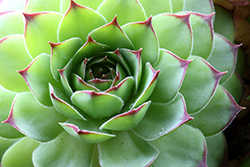
Inspired by the shades on nature, PANTONE® introduces the color of 2017. Greenery is a symbol of new beginnings. It is fresh, revitalizing. As PANTONE mentiones, it symbolizes connecting back to nature in times of political and social turmoil.
 You have probably never realized how important the color of the year is. It inspires everything from interior design to product manufacturing, fashion, beauty and graphic design for the upcoming year. And how was it selected? Leatrice Eiseman, the executive director of the Pantone® Color Institute said that the color represents hopefulness and connection to nature. Its inspiration comes from springtime, where all new things are introduced back into nature. It represents life, regeneration and refreshment. It is something to look forward to. Something, many of us need, when we close the door on 2016.
Colors we surround ourselves with can affect our mood and emotional state. This color clearly represents calmness and connection to nature – it makes you want to take a deep breath and clear your mind.
Greenrey is a combination of yellow and blue, or warmth and a certain cool – it’s a complex blend of two colors that delivered a perfect hue.
HOW PANTONE® SELECTS THE COLOR OF THE YEAR?
The process takes about nine months, is highly subjective, as Pantone® admits, and more about instinct than science. This shade of leafy green has been popping up on runways in 2014. PANTONE® takes notice and keeps it in mind when selecting the shade for each year. Ms. Eiseman said that in the time of stress, you should submerge yourself into nature and walk in the forest. Since not all of us have the ability to do so, you can bring that element back into your environment by putting it on your body, or placing in your home.