The Top Interior Design Colors of the 2010s

pantone

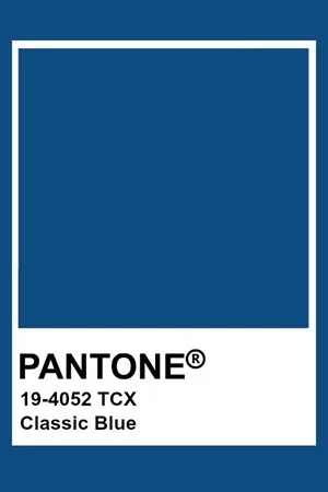
2020 Color of the Year: CLASSIC BLUE

A timeless and enduring blue hue, PANTONE Classic Blue is elegant in its simplicity. Suggestive of the sky at dusk, the reassuring qualities of the thought-provoking color highlight our desire for a dependable and stable foundation on which to build as we cross the threshold into a new era.

Imprinted in our psyches as a restful color, Classic Blue brings a sense of peace and tranquility to the human spirit, offering refuge. Aiding concentration and bringing laser like clarity, Classic Blue re-centers our thoughts.

In order, here are the Pantone Colors of the Year for the 2010s.

2010: Turquoise
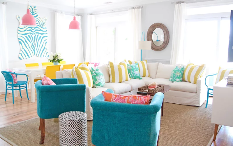
chu-cottage-jane-coslick

photo credit: houseofturquoise.com

Combining the serene qualities of blue and the invigorating aspects of green, Turquoise inspires thoughts of soothing, tropical waters and a comforting escape from the everyday troubles of the world, while at the same time restoring our sense of wellbeing.

2011: Honeysuckle

ae2d376c936fb08a54daa0eb607746dc-credit-pinterest

photo credit: pinterest

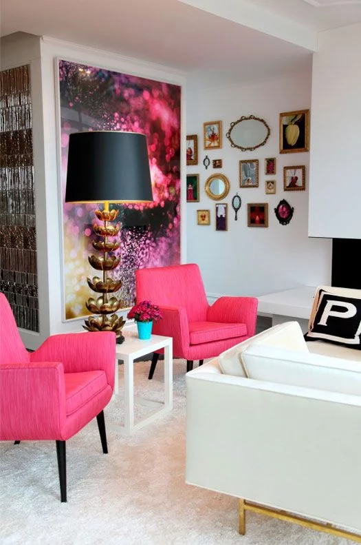
A bright, sherberty pink shade, uplifting and optimistic, evoking nostalgic feelings of summertime.

2012: Tangerine Tango

screen-shot-2011-12-08-at-5.38.04-pm
photo credit: mariakillam.com


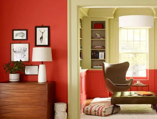
Reminiscent of the radiant shadings of a sunset, Tangerine Tango is a vivacious, magnetic hue that emanates heat and energy.

2013: Emerald

statement-bedroom-wall

photo credit: ratedpeople.com

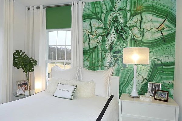
A luminous, magnificent hue, Emerald is the colour of beauty, new life and prosperity.

2014: Radient Orchid

use-radiant-orchid-in-a-room-decor-lounge
photo credit: iyorkinteriordesign.com
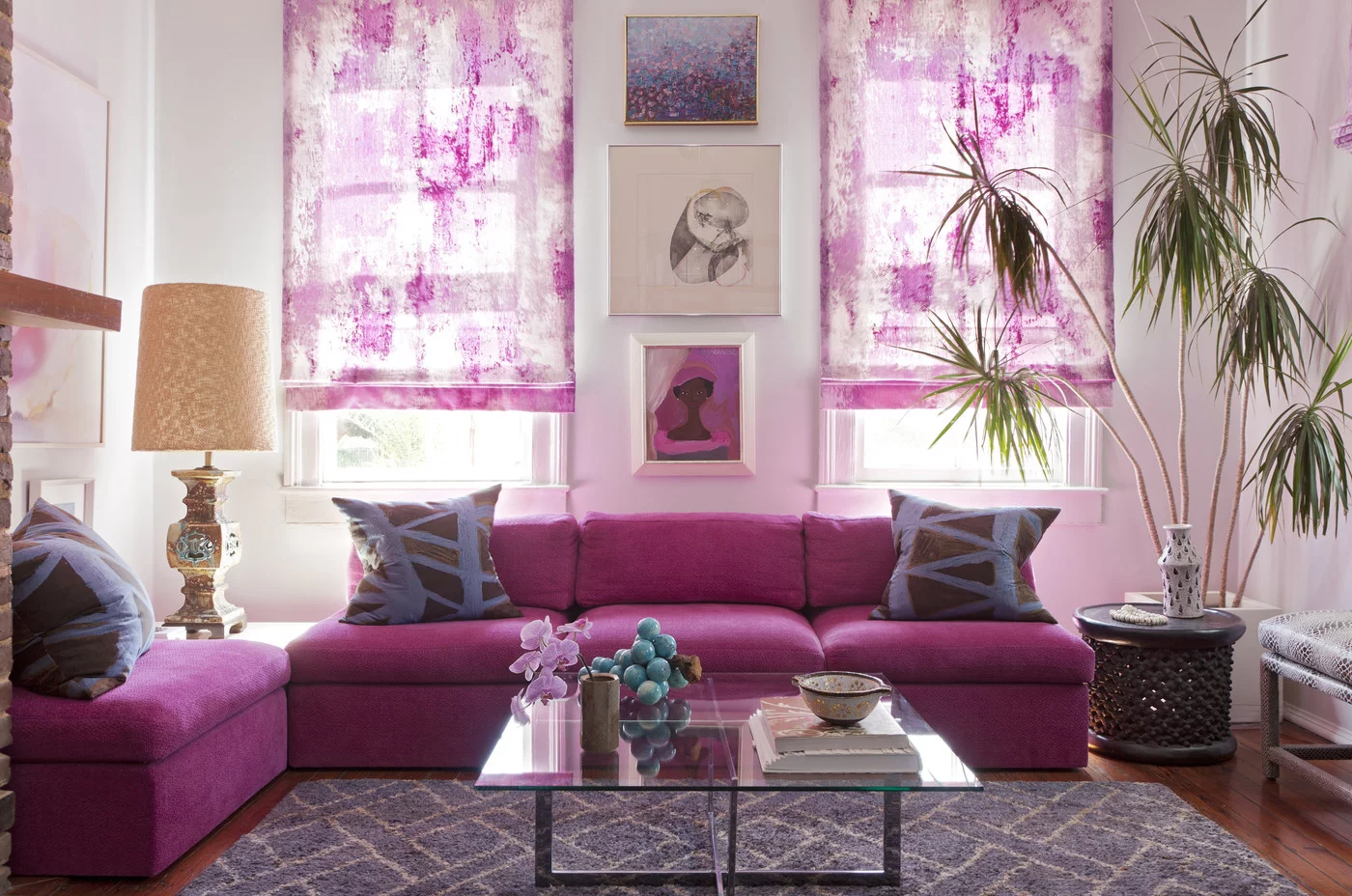
An enchanting harmony of fuchsia, purple and pink undertones, Radiant Orchid inspires confidence and emanates great joy, love and health.

2015: Marsala

002
photo credit: dm-remodel.com
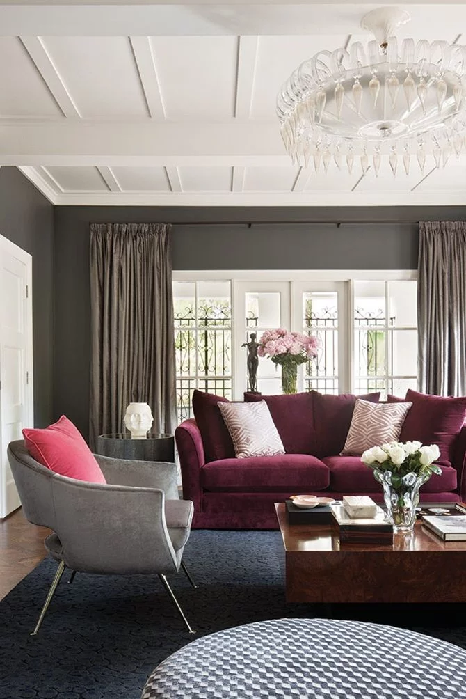
A naturally robust and earthy wine red, Marsala enriches our minds, bodies and souls.

2016: Rose Quartz and Serenity

livingroom_rose_lighter
photo credit: stylestudio

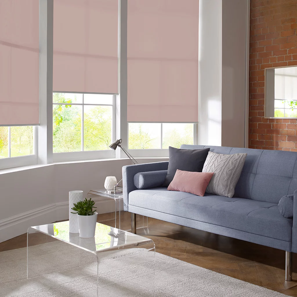
Rose Quartz is a persuasive yet gentle tone that conveys compassion and a sense of composure.

b352f1722b790f33ccfc3958b758a687
photo credit: pinterest

2017: Greenery

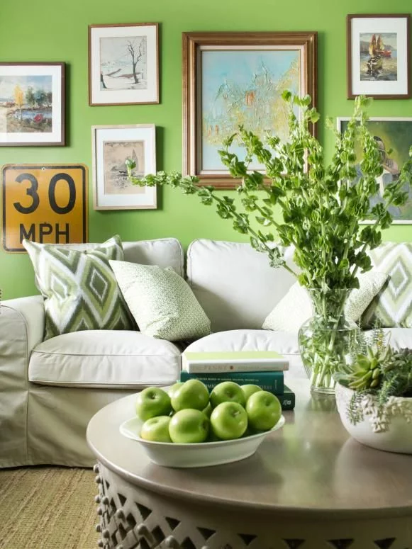
A refreshing and revitalising shade, Greenery is symbolic of new beginnings.

2018: Ultra Violet

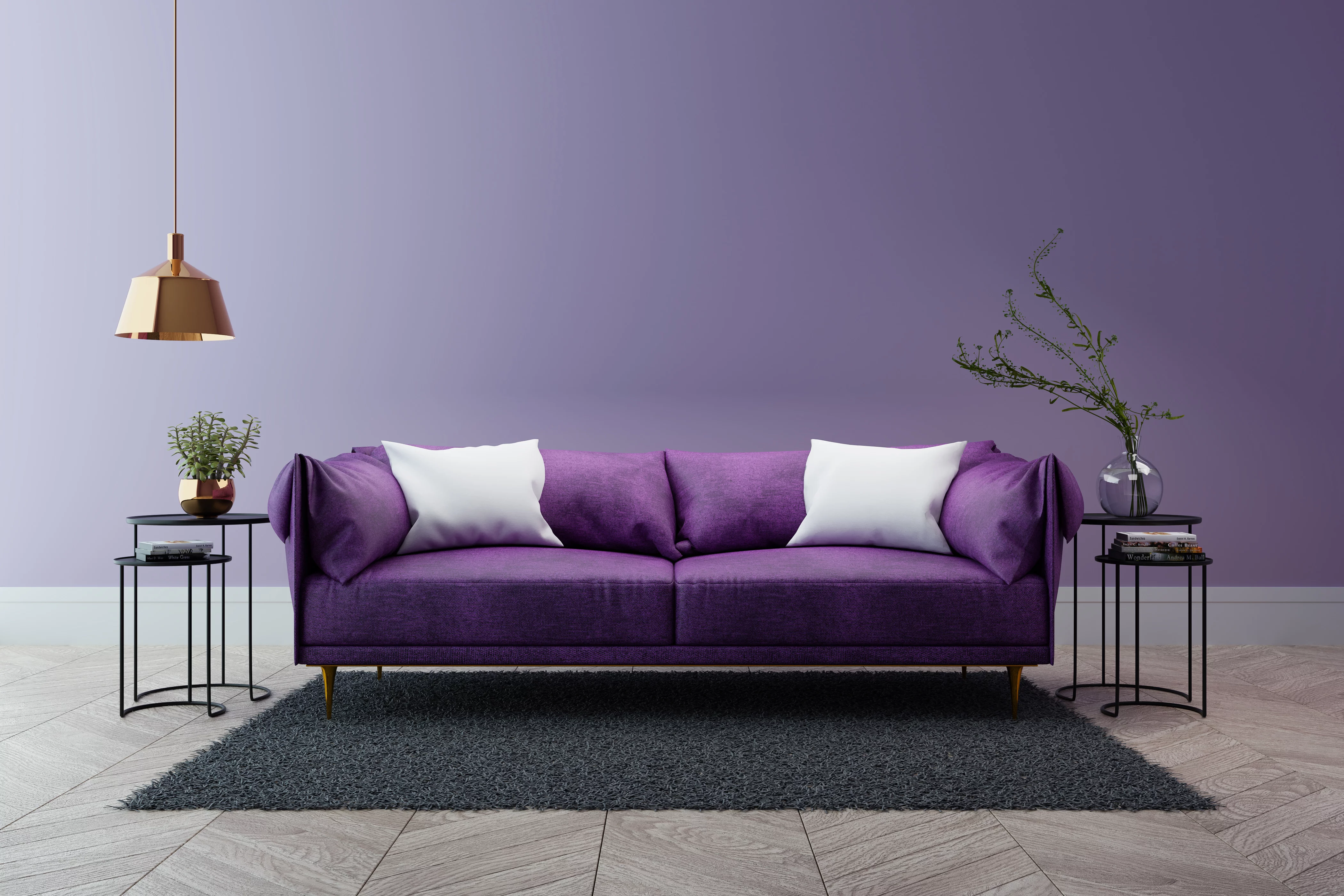
Luxury modern interior of living room ,Ultraviolet home decor concept ,purple sofa and black table with gold lamp on light purple wall and woodfloor ,3d render
photo credit: eastbaytimes
A dramatically provocative and thoughtful purple shade, Ultra Violet communicates originality, ingenuity, and visionary thinking that points us towards the future.

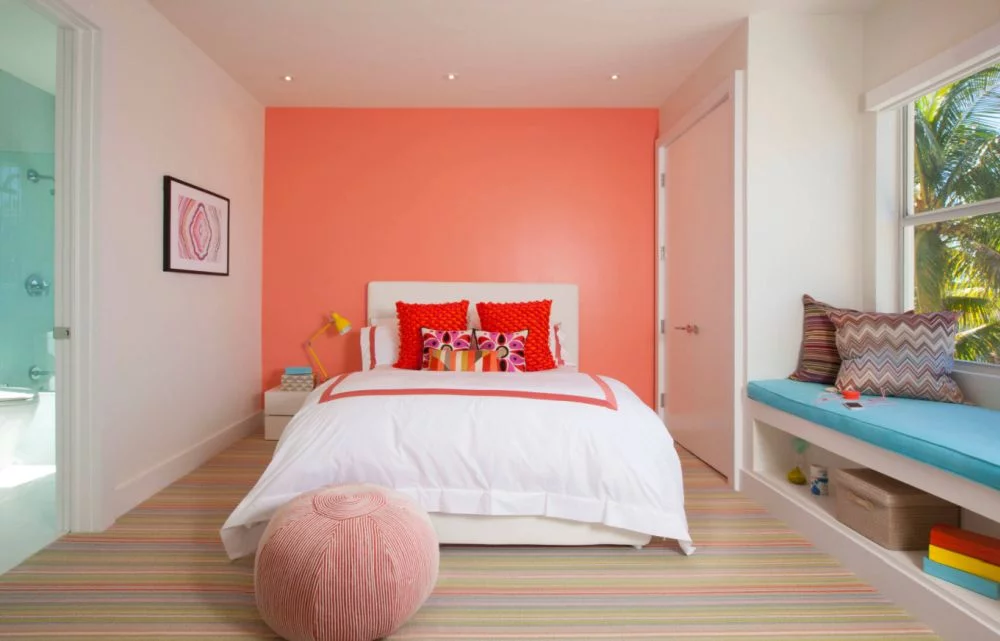
2019: Living Coral

An animating and life-affirming coral hue with a golden undertone that energises and enlivens with a softer edge.

coral-pantone-color-of-2019-interior-design-bedroom-wall
photo credit: homedit.com

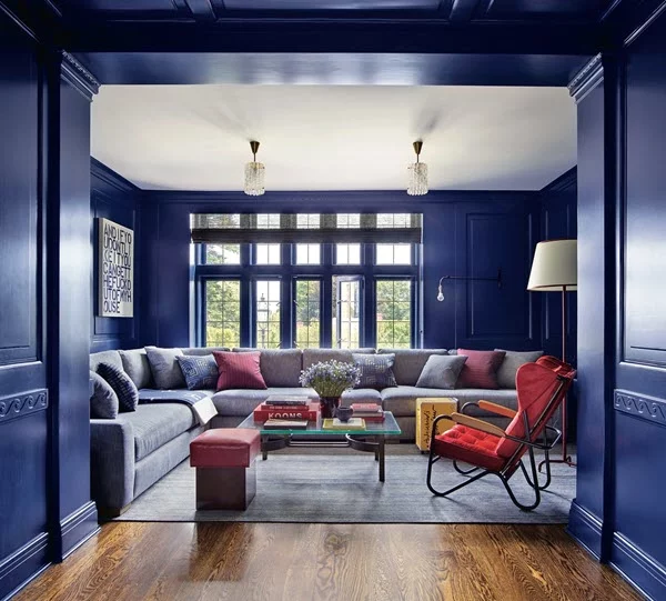
2020: Classic Blue

Non-aggressive and easily relatable, the trusted PANTONE Classic Blue lends itself to relaxed interaction.

classic-blue-pantone2
photo credit: ad.com

What’s Next?

See the entire pallet of PANTONE Color of the Year at www.pantone.com.

ABOUT US

At InteriorLOGIC, we build work environments. From our home office in Madison, WI our award-winning commercial interior design team focuses on creating spaces that work. We continually work to improve the end user experience with each design and our team is well-suited for challenging projects including LEED certification and sustainability projects. For more information about our business and approach, please visit www.intlogic.com.